You notice it fastest in a spreadsheet. Numbers that should look crisp turn fuzzy at the edges, small menu text starts to shimmer, and a slide deck that looked fine on your laptop suddenly feels hard to read on the wall. If you're wondering why projector text looks blurry, the answer usually is not one single defect. It is a chain of small setup decisions, hardware limits, and marketing shortcuts that add up on screen.
That matters more than most brands admit. Movies can hide softness. Text cannot. A projector that feels "good enough" for streaming in a bedroom may fall apart the moment you open a presentation, mirror a desktop, or try to read subtitles from across the room. This is exactly why real-world text testing matters more than inflated spec sheets.
Why projector text looks blurry in the first place
Blurry text usually comes from one of five causes: native resolution, poor focus uniformity, keystone correction, signal mismatch, or a bad projection surface. Sometimes brightness plays a role too, but not in the way cheap projector listings suggest.
The biggest issue is often native resolution. Many low-cost projectors advertise support for 1080p or even 4K video, but that does not mean they display text at that resolution. Support means they can accept the signal. It does not mean the imaging chip inside has enough real pixels to render fine fonts cleanly. If the projector's actual native resolution is lower, it has to scale the image down, and small text gets soft fast.
Focus is the next culprit. Some projectors can produce a center image that looks sharp enough, while the corners stay noticeably fuzzy. That is not your imagination. It is often a lens quality issue, and it shows up much more clearly with documents than with movies. A family watching animation might overlook it. An office team reading columns of numbers will not.
Then there is keystone correction. Digital keystone is convenient, but it often reduces clarity because the projector is reshaping the image electronically instead of projecting it straight-on. The more correction you apply, the more likely text will lose crisp edges. This is one of the most common reasons people think a projector is defective when the real problem is placement.
Resolution claims are where a lot of buyers get misled
A projector can claim big specs and still be weak at text. That is why marketplace listings are full of disappointment. "Supports 4K" sounds premium. In practice, a low-resolution panel with aggressive scaling can turn desktop icons, browser tabs, and small fonts into a blurry mess.
For text-heavy use, native 1080p should be the practical starting point for most buyers, and higher-end models can go further if your content and budget justify it. If you are projecting presentations, spreadsheets, classroom material, or web pages, native resolution matters more than flashy claims about compatibility.
There is also a viewing-size trade-off. The larger you make the image, the larger each pixel becomes relative to the text you are trying to read. A projector that looks decent at 70 inches may feel much less refined at 120 inches, especially if the source includes small interface elements. Bigger is not always better when clarity is the priority.
Focus problems are not always about the focus ring
If text is blurry in the center and blurry in the corners, start with basic focusing. But if the center is sharp and the edges are not, that points to lens and alignment limitations more than user error.
Projectors need to be physically square to the screen. If the projector sits off to one side, too high, or too low, you may be able to force the image into shape with keystone, but the text usually pays the price. The cleanest image comes from proper placement first, adjustment second.
Screen flatness matters too. Projecting onto a textured wall, uneven paint, or a wrinkled portable surface can make letter edges look unstable. People often blame the projector when the real problem is the wall. Text is unforgiving that way. A proper screen, especially one suited to the room's lighting, can make the same projector look dramatically more professional.
Why cheap brightness claims can make text look worse
Brightness is necessary, but it is not a magic fix for blurry text. In fact, poor-quality "bright" projectors often look harsher without looking clearer. They push light output in ways that do not improve optics, contrast, or panel quality, so white backgrounds can glow while characters still look soft.
In bright rooms, lack of contrast is a major readability problem. Text may not be technically out of focus, but if the room washes out blacks and lowers separation between letters and background, the result feels blurry. This is especially common in office spaces with overhead lighting or living rooms used during the day.
That is why room fit matters. A projector built for darker movie nights may not be the right choice for daytime spreadsheets. Likewise, a bright-room model paired with the wrong wall or screen still may not deliver the clean text people expect. Real-world performance is always about the whole setup, not one headline spec.
The source device can also be the problem
Sometimes the projector is doing its job and the source signal is not. Laptops mirrored at the wrong resolution, streaming sticks forcing odd output formats, or presentation devices scaling desktop content improperly can all soften text.
This shows up often when someone mirrors a high-resolution laptop display to a lower-resolution projector and expects perfect desktop sharpness. Operating systems may scale fonts one way on the laptop and another on the projector. The result can look fuzzy even if the projector itself is focused correctly.
If you are presenting slides, set the source output to the projector's native resolution whenever possible. Avoid unnecessary adapters or wireless solutions that compress or rescale the image poorly. Wireless convenience is great when implemented well, but weak transmission hardware can introduce artifacts that are easy to miss in video and obvious in text.
How to tell what kind of blur you actually have
Not all blur is the same, and the fix depends on the pattern. If the entire image looks soft, suspect focus, low native resolution, or source scaling. If only the corners are soft, think lens quality or physical alignment. If straight lines look jagged or letters seem oddly processed, too much keystone is a likely cause. If text looks washed out more than soft, the room light and screen surface may be the real issue.
This is why side-by-side testing can be so revealing when done honestly. The same sentence, same screen size, same room, same source device - that tells you far more than a spec chart ever will. Text clarity is one of the fastest ways to separate a real-use projector from a budget model built to win clicks.
What to do if your projector text looks blurry
Start with placement. Put the projector directly in line with the screen and reduce keystone correction as much as possible. Then set the image to the projector's native resolution from the source device.
Next, check the screen size. If you are pushing the projector to a huge image for a desktop-style task, scale it back and see if readability improves. A smaller, sharper image is usually more useful than a massive one with fuzzy text.
After that, look at the surface. A proper screen can improve clarity, perceived contrast, and uniformity. If you use the projector in daylight or office lighting, the screen choice becomes even more important.
Finally, be honest about the projector itself. If the lens cannot hold focus across the image or the native resolution is too low for your use case, no menu setting will fully fix it. This is where buyers get trapped by low-cost marketing. A projector designed mainly for casual video will not suddenly become a sharp business-display tool because the box mentions 4K support.
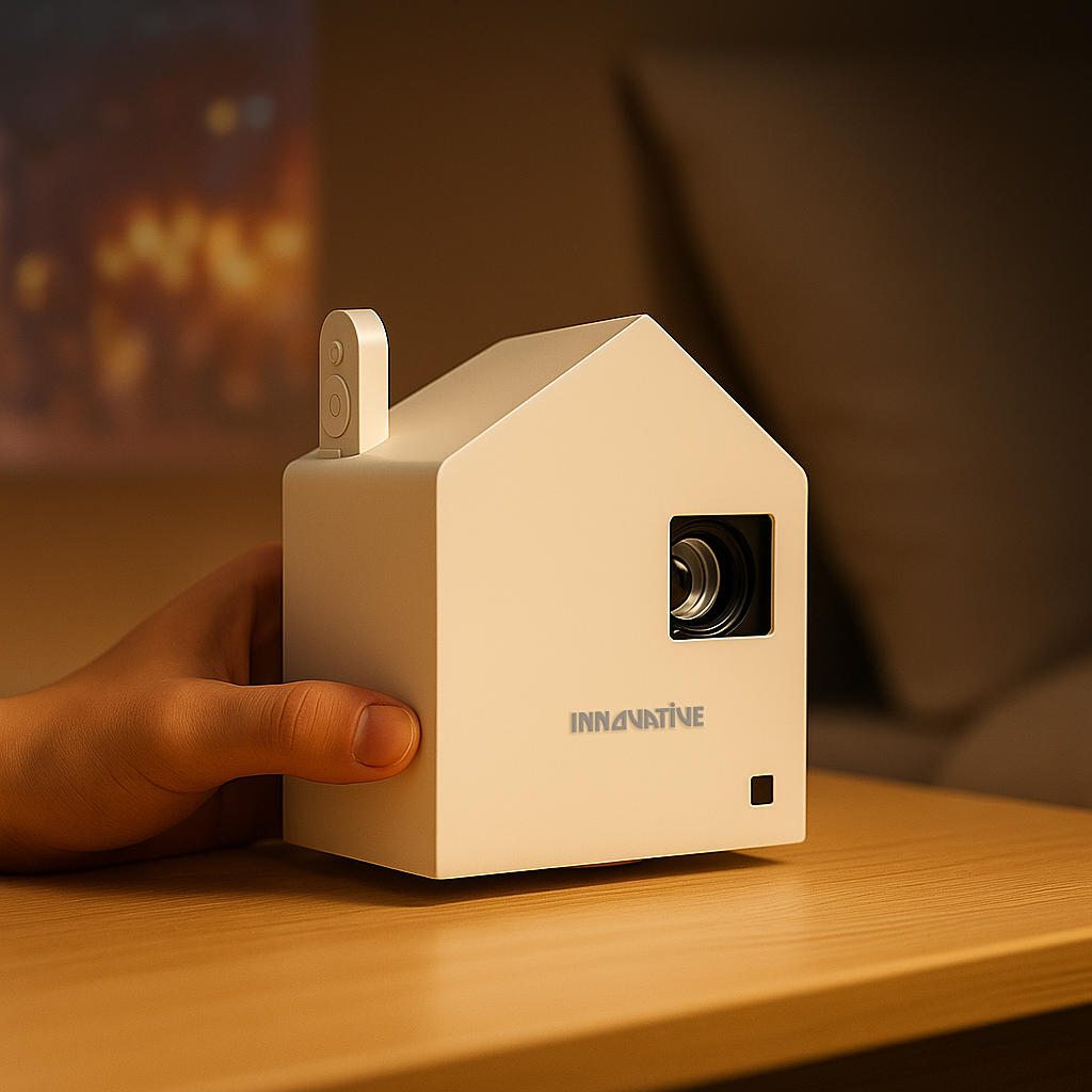
At INNOVATIVE Projectors, this is exactly why text-clarity testing belongs in the buying process. People do not live inside spec sheets. They stream in bedrooms, work in bright conference rooms, teach in shared spaces, and move gear from room to room. The right projector is the one that stays readable where you actually use it.
If your text looks blurry, do not assume projection itself is the problem. Most of the time, the issue is a mismatch between the projector, the room, and the job you are asking it to do. Fix that match, and the screen starts looking a lot more like it should.