A projector for spreadsheets and text has one job above all else - make small details easy to read without turning every meeting into a squint test. That sounds simple, but it is exactly where many cheap projectors fall apart. A picture can look fine with a movie trailer and still be terrible when you open Excel, a dense PDF, or a slide full of numbers.
That is why buying for business, teaching, or serious home-office use needs a different filter than buying for movie night. You are not chasing flashy color claims or inflated brightness numbers. You are chasing legibility, consistency, and a setup that works every time someone plugs in a laptop five minutes before a presentation.
What makes a projector good for spreadsheets and text?
Text clarity is a mix of resolution, lens quality, contrast, brightness, and placement. If one of those pieces is weak, the whole image suffers. You can have plenty of brightness and still get fuzzy letters around the edges. You can have high resolution on paper and still end up with washed-out gray text in a bright room.
For spreadsheets in particular, the challenge is density. You are often showing thin grid lines, small fonts, and lots of columns. That demands a sharper image than casual video viewing. Presentation slides are a little more forgiving, especially if the layout uses large headlines, but once financial tables or data-heavy dashboards appear, the projector has to do real work.
This is where buyers get misled by marketplace marketing. Many low-cost models advertise huge lumen numbers and support for high resolutions, but those claims often tell you very little about how readable a sheet of numbers will look in an actual room. Real-world testing matters more than spec-sheet theater.
Resolution matters, but not in the way sellers imply
If you want a projector for spreadsheets and text, native resolution should be near the top of your list. Native 1080p is a solid baseline for most offices, classrooms, and home workspaces. It gives enough detail for presentations, browser windows, and moderate spreadsheet use on sensible screen sizes.
Where it depends is screen size and viewing distance. A 1080p projector can look excellent at 80 to 100 inches when people sit at a normal meeting-room distance. Push that image too large, or ask the back row to read tiny cells, and the limits show up fast.
If your use case is heavy spreadsheet work, engineering drawings, detailed reports, or side-by-side windows, stepping up in sharpness can help. But resolution alone is not a magic fix. A poor optical system can soften the image even if the spec sheet looks impressive. That is why text-clarity testing is more useful than marketing language about supported formats.
Brightness is not just about the projector
Most people start with brightness because they know conference rooms and classrooms are rarely pitch black. That instinct is right, but the buying logic often goes wrong. A brighter projector is helpful, yet brightness without contrast and proper setup can still produce a flat, hard-to-read image.
For text, especially black text on white backgrounds, ambient light is the enemy. Overhead lights, windows, and glossy wall surfaces wash out the difference between letters and background. That reduces readability long before the image looks obviously dim.
A better way to think about brightness is this: how much room light do you need to fight, and what screen size are you trying to fill? A modest image in a controlled room needs far less output than a large image in an open office during the day. If you present with blinds open and lights on, buy for that reality, not for a perfect demo-room fantasy.
This is also where screen choice matters more than people expect. Pairing the right projector with the right screen can do more for text visibility than chasing exaggerated brightness claims on a bargain model.
Why contrast and optics decide whether small text survives
A projector that is technically bright but low in contrast often makes documents look tired. Whites look dull, blacks look gray, and thin letters lose definition. That matters less with cartoons and more with spreadsheets, dashboards, and document review.
Good optics are just as important. Edge-to-edge focus is a real issue in presentation use. If the center of the image looks sharp but the corners soften, the people reading the margins of a spreadsheet will notice immediately. You want a projector that holds clarity across the full screen, not one that only looks crisp in the middle during a product photo.
Keystone correction can also hurt text if overused. It is convenient, and sometimes necessary, but heavy digital correction can reduce sharpness. If text is the priority, proper placement beats aggressive image correction. Near-wall and ultra-short-throw setups can be excellent in the right room, but they need to be matched carefully with the surface and mounting position.
Best setup choices for office and classroom text clarity
The best projector for spreadsheets and text is not always the one with the most features. It is the one that fits the room, the screen size, and the way people actually present.
In a small meeting room, a portable wireless projector can be a smart choice if it still delivers strong native resolution and real brightness. Convenience matters when teams move between rooms or need quick setup with minimal cables. But portability should not come at the cost of readable text. Some ultra-compact models are great for casual slides and weak for dense documents.
In a larger office, you need more output and stronger optics. This is especially true if people present during the day or if the room cannot be fully darkened. A fixed installation with a proper screen and mount often beats a lightweight grab-and-go setup because it removes variables. Once the image size, throw distance, and alignment are dialed in, the projector performs consistently instead of relying on whoever set it up that morning.
For educators, the same rule applies. If students need to read a worksheet, not just watch a video clip, clarity has to come first. A projector that handles text well usually handles slides and video just fine. The reverse is not always true.
The screen can make or break a projector for spreadsheets and text
A lot of buyers treat the screen as an afterthought, then wonder why the image looks weak. If you are projecting spreadsheets and text, the surface matters. A proper projector screen gives you a more predictable, uniform image than a painted wall, especially under ambient light.
In bright rooms, an ambient light rejecting screen can help preserve contrast and keep white backgrounds from getting blown out. In dedicated office installations, that can be the difference between an image people can read and an image they tolerate.
Portable screens also have a place, especially for teams that present in different locations. But stability and surface quality matter. Wrinkles, poor tension, and inconsistent material all work against text readability.
Common mistakes buyers make
The biggest mistake is buying based on headline specs instead of use case. A projector that looks exciting online may be built for casual entertainment, not documents. Sellers know that big brightness numbers and 4K language attract clicks. That does not mean the projector is good at rendering a spreadsheet at 9 a.m. in a bright conference room.
The second mistake is sizing the image too large. Bigger is not automatically better. If your audience cannot read the smallest content comfortably, the extra size is doing more harm than good. A smaller, sharper image often beats a giant washed-out one.
The third mistake is ignoring placement. If the projector is off-axis, relying heavily on keystone, or sitting on a table where people walk in front of it, the room is working against you. Ceiling mounts, wall trays, and properly planned throw distance are not extras when readability matters. They are part of the solution.
How to choose the right projector for spreadsheets and text
Start with your room, not the spec sheet. Ask how bright the space is during real use, how large the image needs to be, and whether the setup will stay fixed or move between rooms. Then choose native resolution and brightness that match those conditions.
Next, think about content. If you mostly show headline-driven slides, your needs are lighter. If you present dense spreadsheets, financial reports, CAD views, or detailed lesson materials, be stricter about sharpness and contrast. Text clarity is not a bonus feature in that case. It is the whole point.
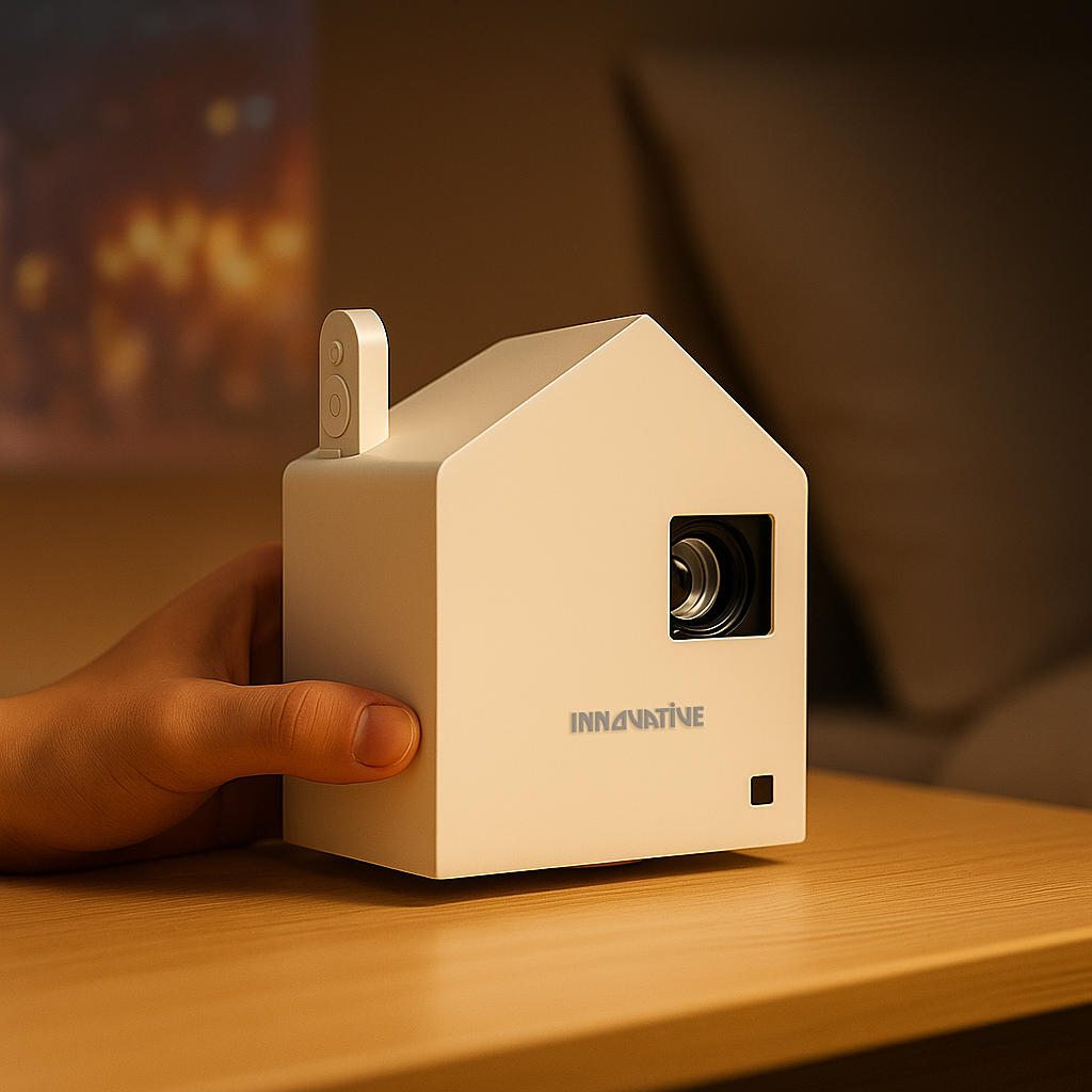
Finally, build the full system. The right projector, screen, and mounting approach work together. That is the difference between buying a box and building a dependable presentation setup. Brands that test for real-world text performance, rather than hiding behind inflated marketing claims, tend to get this right. That is why customer-first retailers such as INNOVATIVE Projectors put so much emphasis on scenario-based recommendations instead of one-size-fits-all hype.
If you are shopping for a projector for spreadsheets and text, trust what will be readable on a Tuesday morning under office lights, not what looks dramatic in a dark demo clip. Your eyes, your team, and your audience will know the difference.