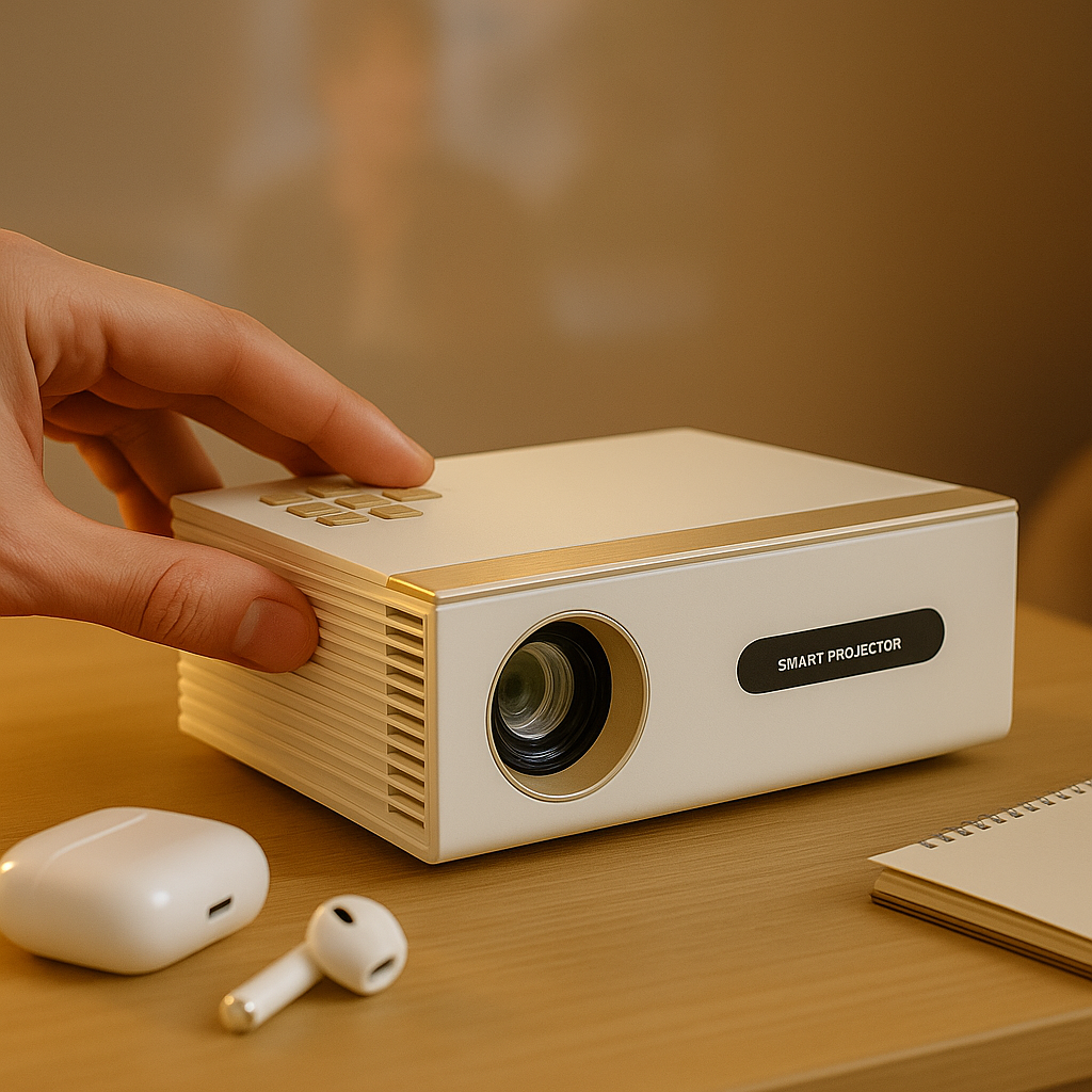
If you've ever watched a sales dashboard turn into a gray blur the moment it hits the wall, you already know why a projector for spreadsheets text clarity test matters. Movies can hide a lot. Spreadsheets cannot. Tiny numbers, thin gridlines, small labels, and packed columns expose weak optics, soft focus, fake brightness claims, and bad image processing faster than almost any other use case.
That is why office projector buying goes wrong so often. Too many people shop from a spec sheet built for entertainment, then expect clean Excel, Google Sheets, or financial software in a bright meeting room. The result is predictable - washed-out whites, fuzzy text near the edges, and the awkward moment when everyone in the room leans forward instead of looking relaxed.
Why a projector for spreadsheets text clarity test reveals the truth
A spreadsheet is one of the hardest things for a projector to display well. It is full of high-contrast detail, but not the kind that flatters a mediocre image. On a movie scene, softness can look cinematic. On a spreadsheet, softness means the 8 looks like a 3 and adjacent columns start bleeding together.
This is also where cheap projector marketing falls apart. Inflated lumen claims might sound impressive, but brightness alone does not make text readable. A projector can blast out a harsh, uneven image and still fail to show fine lettering cleanly. Real text clarity depends on the full chain - native resolution, lens quality, focus consistency, contrast, image scaling, and how the projector handles small fonts across the entire screen.
When we talk about testing for office use, we are not asking whether a slide deck appears on a wall. We are asking whether rows stay readable from the back of the room, whether numbers remain distinct in ambient light, and whether the corners look as sharp as the center. That is a different standard entirely.
What actually makes spreadsheet text look sharp
Native resolution matters more than marketing buzzwords. If your source content is dense with numbers and text, lower native resolution creates immediate compromises. A projector that scales aggressively can make large charts look acceptable while still smearing small labels and cell borders. For spreadsheets, you want enough real pixel structure to preserve detail instead of inventing it.
Lens quality matters just as much, and it gets ignored far too often. A projector can have decent brightness and still fail a text-clarity test because the optics are soft at the edges or cannot hold precise focus across the screen. In a business setting, that means the first few people think the image looks fine while everyone seated off-axis or farther back struggles to read the right side of the sheet.
Contrast plays a bigger role than many buyers expect. Text readability is not just about white output. It is about separation. Black text on a pale background needs enough contrast to avoid turning into a low-energy haze, especially in rooms with windows, overhead lights, or white walls bouncing light back onto the screen.
Then there is image processing. Some projectors sharpen too aggressively and create halos around letters. Others smooth the image so much that thin lines disappear. Neither is good. Spreadsheet clarity is about clean edges, not artificial punch.
How to run a real-world spreadsheets text clarity test
A proper spreadsheets text clarity test should look boring. That is the point. Use an actual spreadsheet, not a showroom demo loop. Open a file with narrow columns, mixed font sizes, bold and regular text, decimals, and gridlines. Include a few tabs with charts, but keep the focus on dense tables because that is where bad projectors get exposed.
Test it at the size you will really use. A projector that looks sharp at 60 inches may fall apart at 100 or 120 inches. This is where many side-by-side comparisons become misleading. One unit may be throwing a much smaller image, which makes text appear sharper than it really is in a matched use case.
Ambient light should stay realistic. Do not test in a blacked-out room if the projector is going into a conference room, classroom, or office with daylight and ceiling lighting. You want to know whether small numbers are still clear at 10 a.m., not just whether they can be read in a cave.
Sit where your audience will sit. The front row is not the test. Move to the back. Move off center. Check whether column headers remain legible and whether fine borders still separate cells cleanly. A business projector should perform for the room, not just the person standing closest.
What to look for during the test
Start with small font readability. Can you comfortably read standard spreadsheet text without squinting? Then check line separation. Do rows stay distinct, or do they begin to merge? After that, inspect the edges and corners. Many weak projectors look acceptable in the middle and noticeably softer around the perimeter.
Also watch for color fringing, uneven brightness, and focus drift. If black text has a colored outline, if one side of the image looks dimmer, or if the projector never quite snaps into crisp focus, those issues will become more annoying over time, not less.
Common buying mistakes that ruin text clarity
The first mistake is treating brightness as the whole story. More light helps in bright rooms, but only if the image remains controlled. A projector with poor optics and exaggerated lumen claims can create a loud image that still looks cheap and unreadable with office content.
The second mistake is choosing based on entertainment features first. Wireless streaming, battery capability, and portability are great when they support the use case. They do not replace clarity. If your primary job is presenting financials, operations reports, lesson plans, or dashboards, text performance comes first.
The third mistake is ignoring the screen and room setup. A great projector can look mediocre on a bad wall. Surface texture, color tint, and room light all affect text visibility. In offices and mixed-use spaces, the screen is not an accessory afterthought. It is part of the clarity system.
Why screen choice changes the result
A smooth, appropriate screen helps preserve detail and improve perceived contrast. In brighter rooms, the right screen can help text stand out instead of getting flattened by ambient light. That matters more than people expect, especially if the room doubles as a meeting space and cannot be darkened every time someone opens a spreadsheet.
Placement matters too. If the projector is awkwardly installed and needs heavy keystone correction, text can soften because the image is being digitally reshaped instead of optically aligned. Convenience features are useful, but the cleanest text usually comes from getting the projector physically positioned as correctly as possible.
Matching the projector to the room, not the ad
For a small huddle room, you may not need extreme brightness, but you do need reliable focus and enough resolution for tight content. In a larger conference room with daylight, brightness becomes more important, but not at the expense of image quality. The best answer depends on screen size, viewing distance, room light, and how text-heavy the presentations are.
This is where scenario-based buying beats spec-sheet shopping. A projector for movies in a bedroom is not automatically the right projector for spreadsheets in a meeting space. One use case forgives softness and favors mood. The other exposes every weakness in seconds.
That is why real-world testing matters so much at INNOVATIVE Projectors. A text-clarity tested business model should earn that label by handling actual office content in practical room conditions, not by winning a brightness contest on paper.
So what should you prioritize first?
If spreadsheets are central to your workflow, prioritize native resolution, lens sharpness, and realistic brightness for your room. Then think about screen size and ambient light control. After that, add the convenience layer - wireless connectivity, portability, battery support, or easier installation - based on how your team actually works.
If your projector needs to move between rooms, portability is a real advantage. If it stays in one space, stable mounting and a proper screen may deliver a bigger day-to-day upgrade than any flashy feature. There is always a trade-off. The goal is not to buy the projector with the longest list of claims. It is to buy the one that keeps text clear when the room is full and the stakes are real.
A good spreadsheet image should feel boring in the best possible way. No one should comment on the projector. They should just read the numbers, make the decision, and move on.